Could the ‘colour’ of the year inspire your next custom canvas print?
Every year, painting powerhouse Pantone announces their colour of the year – the shade they think is going to make a splash in the worlds of interiors and in the wider design landscape over the next 12 months. You might recall we covered their colour of the year for 2015, marsala, in a post on the predicted trends of 2015 around this time last year. This year, Pantone has done things a little bit differently and actually chosen two colours and a painting technique to boot. The colours in question or Rose Quartz and Serenity and the suggestion is to put them together using shade blending. So, we’re taking a lead from the interiors folks in the know and sharing some ways you could put the shades to use in your next custom canvas print.
Complement and contrast
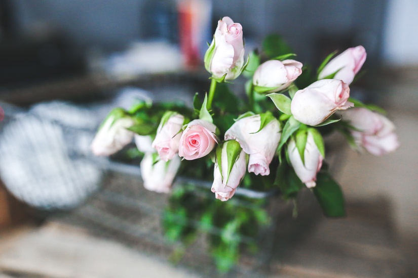
Rose Quartz is a very subtle, gentle, pink, while serenity is a soothing grey-blue hue. These colours complement each other beautifully side by side but you could increase the contrast levels by playing around with texture and shape in your images, whether you’re painting, using an illustration all or putting pencil to paper. Think about putting Rose Quartz shapes on a Serenity background or vice versa. Another idea is to use a scan a vintage black and white photograph and switch in the colours. This would work particularly well with Victorian style portraits.
A study in technique
Pantone are seemingly taking a punt on shade blending being the next big thing. They said: “Joined together, Rose Quartz and Serenity demonstrate an inherent balance between a warmer embracing rose tone and the cooler tranquil blue, reflecting connection and wellness as well as a soothing sense of order and peace.”
While colour blended images can be very soothing to look at they can also be somewhat unsettling. Blending areas can make illustrations or photos appear unclear, mysterious or unfinished, which makes it a great technique to play with. Images featuring water and sky particularly lend themselves to experimentation.
What do you think of Pantone’s selection for the colour(s) of 2016 and how do you feel about colour blending? We'll be talking more about the design trends of 2016 in the coming weeks, so check back if you're planning a decorating project.