Could colour therapy improve your mood?
Here at ParrotPrint, we love sharing new interiors trends and photography techniques but today we’re taking things right back to basics and getting to grips with a little colour therapy. So, instead of focusing on tips and tricks for use behind the camera, today we’re considering whether you might want to select a particular colour theme and what the impact of that theme may be.
What is colour therapy?
Colour therapy works on the principle that colour is formed by light that carries energy. The idea is that particular colours can stimulate our own energy and feelings. Colour therapists use colour in complementary therapy, however, by applying some simple principles you can try and enhance your mood in the home.
Colours for calm
If you want to create a calm space, perhaps to help you feel more relaxed as you work or to help you drift off to the land of nod at bedtime, shades of blues, greens and purples are your best bet. These are colours that provide comfort without over stimulation. Should your next set of canvas prints bring together these soothing shades?
Creating an upbeat space
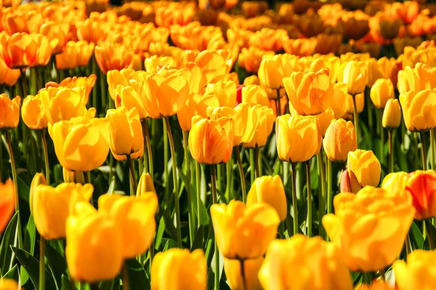
Sometimes, rather than relaxed you need to feel stimulated, energised and ready for the day ahead. Red is known as a colour that stirs excitement but it is also associated with anger and aggression, so may not be your go to choice when creating an upbeat space. Scientists have found that the colour yellow actually helps to wake up the brain. It’s another stimulating shade with positive connotations, which is perhaps why it’s long been a popular choice in kitchens. Could a yellow space help you to start your day better?
How did you decide on the colour themes for the rooms in your home? Do you like to keep things eclectic or do you decorate the space according to the room’s purpose and do colour connotations or colour therapy play a part in the colours that you choose? We’d love to hear about your decorating decisions and the driving force behind them and of course, to see your coloured canvas prints in situ too! Need more colour inspiration? Check out our post on the top shades of 2016.


